

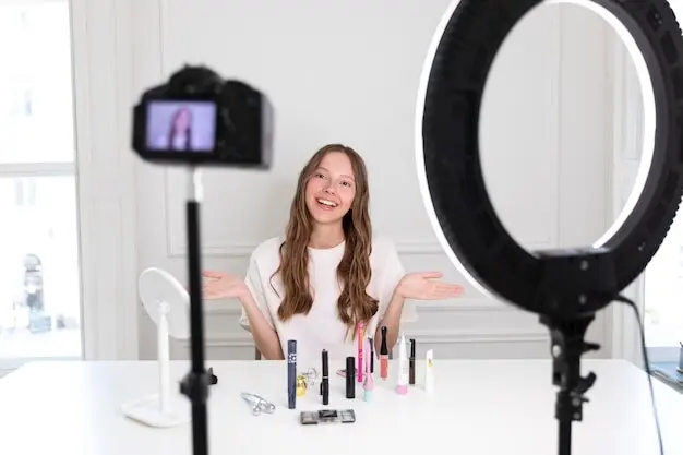

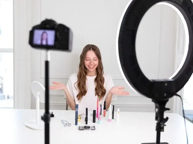


Captions, CTAs, and Titles
Try opening with a benefit, a why, or a quick “before/after” to set context. Use one specific CTA that says exactly what tapping does. Test first-comment alternatives on Instagram, and swap pin titles that highlight problems solved. Keep voice warm and helpful, avoiding urgency that feels pushy. Document learnings in a shared sheet so creators and editors pull from a living library of proven, customer-friendly phrasing.

Landing Pages and PDP Continuity
Match imagery, color, and copy between the post and the landing page so orientation persists after the click. Surface the featured UGC gallery near the fold, and preselect relevant variants when possible. Summarize creator tips, sizing notes, or materials beside the add-to-cart button. Load fast, defer distractions, and ensure accessibility expectations continue. Consistency earns trust, and trust is often the quiet difference between browsing and buying within a single visit.

Checkout Pathways and Payment Options
Evaluate native checkout on Instagram for eligible products, and compare with links that route directly to prefilled carts. On Pinterest, ensure product Pins lead to lightweight pages with visible shipping costs and supported payment methods. Offer accelerated options where appropriate, and minimize surprise fields. Track completion by pathway to refine default choices. When paying feels predictable and quick, every earlier effort—storytelling, tagging, saving—finally pays off with satisfied customers returning confidently.